Unit 1: Feedback form

 UAL Awarding Body

UAL Level 3 Diploma and Extended Diploma in Art & Design

Student Assessment Feedback Form

As   Assignment Title National Student Survey 2016 Competition Live Brief
Unit No & Title Unit 1: Introduction to Visual Language (12 x L3 Credits)

Unit 2: Introduction to Research Skills (12  x L3 Credits)

Unit 4: Introduction to Materials, Process & Skills (12 x L3 Credits)

Student Name Kiera Bennett
Tutor Name Niall Bruckshaw
Assessment Date Monday 14th September – Friday 30th October 2015
Task & Assessment Criteria Tutor Feedback
1 Context & Research

U1 1.1 – Critically compare the characteristics of visual language

U1 2.1 – Apply visual language to influence appearance and meaning.

U1 2.2 – Critically compare the use of visual language to influence appearance and meaning.

U2 1.1 – Critically compare a range of research tools, methods and skills.

U2 2.1 – Critically compare a range of primary and secondary research sources.

U2 3.1 – Apply research tools to record, interpret and develop ideas.

Good analysis of brief reqs. Good work on contextual research on NSS/NUS however you missed the opportunity to analyse how it could help in your design work e.g. “I could implement a timeline, history, lgbt, women rights, digital element into my poster design.”

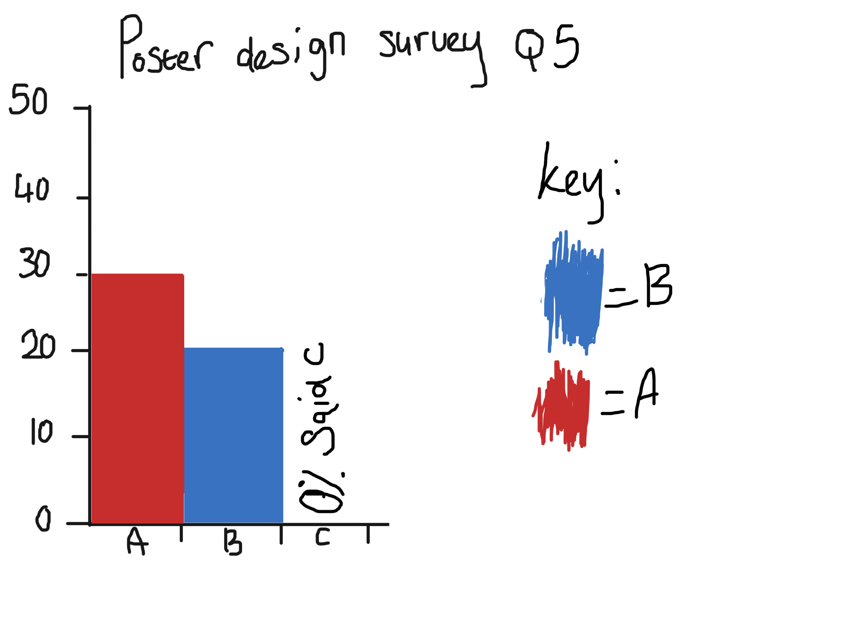
Good use of RoC in poster analysis. I really like the use of overall thoughts section in your research. Be careful of spelling, analyse (UK) vs. analyze (USA). Good focus on colour and space. For distinction just look at more visual elements and principles.

Excellent detailed investigation of history of posters. If you had used images to back up your statements that would’ve been distinction.

Artist research was good. Still a focus on colour but some discussion on texture was interesting.

Very good investigation of type but again pictures of the various typefaces would’ve helped your point.

Interesting primary research survey with good presentation. In the future, to get a good accurate sample population you will need more than 5 people. Plan ahead for this and use SurveyMonkey.

Very descriptive mood board. Mind map could’ve had more than 7 ideas.

2 Planning, Problem Solving, Skills & Design

U1 1.1 – Critically compare the characteristics of visual language

U1 2.1 – Apply visual language to influence appearance and meaning.

U1 2.2 – Critically compare the use of visual language to influence appearance and meaning.

U4 1.1 – Critically compare a range of materials and processes

U4 1.2 – Apply understanding of materials and processes.

U4 1.3 – Apply understanding of technical skills.

Would’ve liked more than 7 preliminary sketches with more detailed annotations for higher marks. Now fixed well done

For your developed ideas, less explanation on how you made the posters and more explanation about why you did it in certain ways would be better. For distinction grades in the future you will need more than 2 dev sketches as well.

On your final design, pay more attention to layout in future. You are definitely right about the blue, and it is good but would benefit from the small print being smaller, the partner logos and QR code being at or nearer the bottom as they draw too much attention and the graphic needs that attention more. Logos moved, QR code should ideally be same size as other logos for consistency. They could have been centered as well. Small print needs to be differentiated from other text by being small. The blue background is the right choice, the blue for the text isn’t, white would’ve been perfect or another colour from a triad colour scheme with blue or even the light grey blue you have used for the screens in the graphic. The graphic is great and well-made but could’ve been cleaner on the right hand side hand where it falls over the screen. I’m not 100% certain about your strapline but it’s a good effort.

3 Evaluation & Reflection

U1 1.1 – Critically compare the characteristics of visual language

U2 1.1 – Critically compare a range of research tools, methods and skills.

U2 2.1 – Critically compare a range of primary and secondary research sources.

U2 3.1 – Apply research tools to record, interpret and develop ideas.

U2 3.2 – Evaluate the effectiveness of research tools to develop ideas.

U4 1.4 – Evaluate the use of materials, processes and technical skills.

Don’t include my questions in your evaluation in future. It’s neater if its laid out in paragraphs.

Correct about Wikipedia, avoid it unless you cant find anything else. Correct about more images. I understand your point about Olly Moss colour scheme but experiment with different ones in future. Make sure you state which typeface you ended up using. Again, I understand your point about colour harmony with the use of lots of blues for text as well as background colour but to really get the effect you were going for look at the comments above. Good discussion of target audience and technique.

You could tidy up your references as well. You don’t need subtitle letters, just list them in alphabetical order.

Comments

Student working at Grade

MERIT/DISTINCTION borderline.
Areas for improvement

Pay more attention to layout in future. Now fixed well done.

Spend a little bit more time on presentation of blog posts e.g. eval and references. Now fixed well done

More preliminary sketches with more annotations. Now fixed well done

More detail on visual analysis.


Tutor Signature Niall Bruckshaw
Date 29/10/2015
IV Signature Neil Matthews
Date 30/10/2015
Candidate Authentication Learner statement of authenticity

I confirm that the attached portfolio is all my own work and does not include any work completed by anyone other than myself.

Student Signature Kiera Bennett

Reading list.

This is my complete reading list for all the sources I have used within my research.

A-Z Bibliograpy:

Britannica. (N.D). Lithography: Printing. Available from: http://www.britannica.com/topic/lithography. [Date Accessed: 5th October 2015]

Clair.K, Busic-snyder,C. (N.D). A typographic workbook- a primer to history, techniques and artistry. A typographic workbook. Second edition. Canada.John Wiley&sons inc. Avaiable from: Https://books.google.co.uk/books?id=Lf0iDYCr6w0C&pg=PA121&lpg=PA121&dq=wolfgang+weingart’s+font’s&source=bl&ots=Uforl7W5t4&sig=kV0Cij678KvIjaDilhITZoN8PgQ&hl=en&sa=X&ved=0CEUQ6AEwCDgKahUKEwjG-p2Wy6vIAhXFhg0KHTFaAAA#v=onepage&q=wolfgang weingart’s font’s&f=false. [Date Accessed: 5th October 2015].

David Hutton.(N.D).(N.T). Available from: http://davidhutton.com/. [Date Accessed: 15th October 2015]

David Hutton.(N.D).Profile. Available from: http://davidhutton.com/about/. [Date Accessed: 15th October 2015].

Darren graphic design(N.D). Darren Walker Graphic Design. Available from: http://www.darrengraphicdesign.com. [Date Accessed: 4th October 2015].

Google search. (N.D). Philip Meggs. Avaiable from: https://www.google.co.uk/?gws_rd=ssl#q=philip+meggs. [Date Accessed: 5th October 2015].

Hutton,D.(N.D).Dub Sided.[Date Accessed:15th October 2015]. Available from: http://davidhutton.com/work/dub-sided/.

International poster. (1997-2015). International poster gallery. Avaiable from: http://www.internationalposter.com/about-poster-art/a-brief-history-of.aspx. [Date accessed: 4th October 2015- 5th October 2015].

Thenationalstudentsurvey.(N.D).Thenationalstudentsurvey.Avaiable from:www.thestudentsurvey.com.Date Accessed:18th september 2015

The national student survey. (N.D). the national student survey .Available from:www.thenationalstudentsurvey.com/students.php. [Date Accessed:18th september 2015].

nus.(N.D).National Union of Students. Available from: http://www.nus.org.uk/en/who-we-are/our-history/a-brief-history/. [Date Accessed: 25th September].

nus.(N.D). National Union of Students. Available from: http://www.nus.org.uk/en/who-we-are/our-history/a-brief-history/. [Date Accessed: 26th September 2015].

nus.(N.D).National Union of Students.Available from: http://www.nus.org.uk./en/who-we-are/. [Date Accessed: 25th September 2015].

nus.(N.D). National Union of Students. Available from: http://www.nus.org.uk/en/who-we-are/how-we-work/black-students/.%5BDate Accessed: 25th September 2015]

nus.(N.D).National Union of Students. Available from: http://www.nus.org.uk/en/who-we-are/how-we-work/disabled-students/.%5BDate Accessed 26th September 2015].

nus.(N.D). National Union of Students.Available from: http://www.nus.org.uk/en/news/design-a-poster-and-win-/ [Date Accessed: 28th September 2015].

nus.(N.D).National Union of Students. Avaiable from: http://www.nus.org.uk/en/who-we-are/how-we-work/lesbian-gay-bisexual-and-trans/. [Date Accessed: 25th September 2015].

nus.(N.D). National Union of Students. Available from: http://www.nus.org.uk/en/who-we-are/how-we-work/women/.%5BDate Accessed: 25th September 2015]

Moss,O.(2015).Firewatch. Available from: http://ollymoss.com/#/firewatch/. [Date Accessed: 15th October 2015].

Olly moss.(N.D).(About). Available from:http://ollymoss.com/about/. [Date Accessed: 15th October 2015].

Olly moss.(N.D).(N.T). Available from:http://ollymoss.com/. [Date Accessed: 15th October 2015].

Prades,S.(N.D).Autumn.[Date Accessed: 15th October 2015]. Avaiable from: http://www.simonprades.com/index.php/project/autumn/.

Prades,S.(N.D).Autumn.[Date Accessed: 15th October 2015]. Avaiable from: http://www.simonprades.com/index.php/project/autumn/.

push pin inc.( N.D). About pushpin. Avaiable from: http://www.pushpininc.com/about/pushpin/. [Date Accessed: 5th October 2015].

Right ear left. (N.D). Milton Glaser: Designing Dylan. Avaiable from: Https://rightearleft.wordpress.com/2015/03/09/milton-glaser-designing-dylan/. [Date Accessed: 5th October 2015].

Simon Prades .(N.D). Work. Available from:http://www.simonprades.com/index.php/project/. [Date Accessed: 15th October 2015].

Simon Prades.(N.D).About. Available from: http://www.simonprades.com/index.php/about/. [Date Accessed: 15th October 2015].

Visual art corks.( N.D). Lithography: Type of printmaking. Avaiable from: http://www.visual-arts-cork.com/printmaking/lithography.htm. [Dated Accessed: 5th October 2015].

Victoria and Albert Museum. (2015). Study Room Resource: Art Nouveau. Avaiable from: http://www.vam.ac.uk/content/articles/s/study-room-resource-art-nouveau/. [ Date Accessed: 5th October 2015].

Ward, B. (2009). Be heard. [ Date Accessed: 29th September 2015]. Available from: http://www..nus.org.uk/en/news/design-a-poster-and-win-/

Walker,D.(N.D). NSS poster design. [Date Accessed: 4th October 2015]. Available from: http://www.darrengraphicdesign.com

Wikipedia. (N.D). Offset Printing. Avaiable from: https://en.wikipedia.org/wiki/Offset_printing. [Date Accessed: 5th October 2015].

Wikipedia.(N.D).Olly Moss. Available from: https://en.wikipedia.org/wiki/Olly_Moss. [Date Accessed: 15th October 2015].

Unit 1: Evaulation.

This is my evaluation for Unit 1.

For my project I feel that my research sources were appropriate to my unit as they all related to the elements of poster design and didn’t go off topic at any time throughout my project. I thought that they were reliable however I feel that the Wikipedia pages I looked at might not be reliable as people can edit them at any time and change the information on it as well as edit links and images, which can lie or give false information on the person/topic you’re looking at. The context affected my research in a good way because there was plenty of information about typography and other things relating to poster design which helped my research because I could then write as much information as I wanted on a topic. I think that next time I will try to use more images in my work to describe things better.

For my poster I tried to do an illustration style based on one of my artists work (David Hutton) and I did the colouring in the style of my second chosen artist (Olly Moss) , I feel that the image I’ve used is suitable for the concept of the poster as it’s supposed to persuade final year students to fill out the national student survey so I feel that the image I’ve drawn is suitable because most people use their phones nowadays to go on social media, fill out forms and surf the net. In proportion to the rest of my project I feel that it works because I’ve used the artist’s styles and haven’t strayed and did something completely different. With my colours I tried to do the poster colours like my second chosen artist Olly Moss so I did them all monochromatic to fit in with his colour style. I didn’t use any effects on my poster as I wanted it to be simplistic and not super busy.

Looking at my font choices for my poster I think that they were legible enough for people to read them, most of the fonts I chose were in a thick or thin style that were plain and easy to read big or small. The font I chose for my poster fit the purpose of informing people and the readability was good as people would be able to read it up close, the comfort of reading was good as people wouldn’t have to strain their eyes to read the information on the poster.

Looking at the proportion of my design the arrangement of my drawing is good because it’s placed almost at the top of the image which is good because it’ll be the first or second thing that people look at , because of its placement within the piece and because it’s the second biggest object on the poster. The colours work well because there all monochromatic also they work because there not super bright and it’s easy on the eyes. There’s also balance between the colours and text because there’s plenty of both although the colour is more dominant within the poster. There’s harmony between the colours as they’re both from the same colour so they have harmony between each other.

My poster is fit for my audience because it meets the brief and is language appropriate because it doesn’t contain swearing nor any slang words, it also follows the brief because it relates to final year students and it persuades students to fill out the survey. It communicates to the audience because it features phones which nowadays everyone uses in some form or another; students tend to use phones to surf the net and go on social media, the colours I chose helps because it looks like social media colours (e.g.: Facebook/twitter). It is age/sex and race appropriate because it doesn’t strictly fit with specific race/age or sex it fits with everyone.

I chose to make my poster digitally because I prefer digital mediums to traditional mediums. I found the quality to be ok when printed, however because I did my poster in Photoshop if you zoom in enough it will start to become pixelated and show all the small pixels, whereas I think if I’d used Illustrator it the finished poster would have come out a lot crisper and cleaner. I think the presentation is good, I think my use of colour is good because as mentioned previously all the colours are monochromatic and are all different shades of the same colour which I think looks good because it’s easy on the eyes to look at. My use of line could’ve been improved as I’d sketched out the lines rather than sketching them out and then going over them with the pen tool to make them neater and look better. I used tone in my piece but not in shading terms, instead I used lighter and darker colours to make the hands look like they’re fading away or there’s a lot of them. I didn’t really use shape in my piece but I wanted to make the hands go behind the main hand so that it looked effective and not messy. I didn’t use texture in my poster.

I am very happy with my design however I would have changed the hand drawing a little and made more hands and then used lighter colours to fade them out more, I would have also gone over the hand drawings with the pen tool so that they would have looked crisper and better than if I just left them like I had. I think that I’ve used my time effectively as I’ve gotten most of my work done all I need to do is finish writing up extra bits on my blog and then upload it all to my actual blog ready to be marked. There were no safety concerns that I had whilst making my poster.

As an overall evaluation of my entire unit I feel that I did well, although I would have liked to have done another piece of primary research so that I had a variety of answers to look through, so that I could have added extra’s to my final poster design. I think that I could have also added in a few more images to my research to make it more fun to  look at instead of having a big wall of text to read through. Compared to a previous National Student Survey winner who has used mainly small amounts of colour and a dark background which I think personally doesn’t appeal to final year students, I think my final poster design is more appropriate and appeals more to final year students because  the colour scheme I’ve chosen is all one tint, which means that it’s easy on the eye’s because none of the colours are super bright nor randomly selected, which can be unpleasant to look at if the colour’s clash with one another or aren’t placed in such a way that they work together nicely. However I think that if I were to do this unit again I would have as mentioned above added in some more images to break up the text, as well as added in some more poster comparisons so that I could have done a bigger overall comparison to maybe four different posters from four different winners/designers. I feel that I could have also experimented more with colour, though I was trying to stick to my chosen artist’s style’s, I feel I could have gone further and chosen colours that would have worked together and done some more colour research into what each colour represents so that I could try combinations that would have looked effective when viewed on a wall or bigger screen. Though having said that I’m pleased with what I’ve achieved during these few weeks.

Unit 1: Final poster design

poster

poster- welsh

This is my final poster design, I like the design because I feel that it appeals more to final year students as the drawing I’ve done for my poster has phones on it which everyone uses. I think that the colours I’ve used also help to appeal to my target audience because liked mentioned on my evaluation I think that the colours would remind students of social media’s such as Twitter or Facebook which could be used to advertise the NSS’ survey which could grab student’s attention and get them to fill it out.Having said that I think the poster is good I still think that there could have been improvements to the design, for example I could have kept the sketched hands but gone over the sketch with the pen tool on a separate layer to make them ‘cleaner’ and less wobbly to look at, I would have also added more hands in different shades of blue and tried to give the illusion of them fading out I would have also tried to achieve this look by using a soft rounded brush in Photoshop. Overall I’m happy with my poster design and I think if the NSS were to use this poster I think it would stand out in a busy street because of the bright colours and the what I think could be a memorable tag-line.

Unit 1: poster: Big poster design 2

big poster design 2

Poster development drawing 2/2:
I chose this design as my final design because I liked how it looked
in the small sketch. I also liked it because I felt that it fitted my target
audience (Final year student’s) because most student’s use phone’s
to either surf the web or look at social media. I felt that this design would
more than likely grab student’s attention as this could be a very good
form of advertisement, quick knowledge and maybe in the future a
source of question and answers, it may also be of use to lots of student’s
as it could be a good information line, if the design was to be incorporated
as a website banner etc, it could have a Facebook group linked into it
where student’s could relieve advice on course’s, college’s and tutor’s. I thought
this design would work better and promote the NSS. I first started  off much like
my previous big design by making a coloured background and then sketching out the
hands and putting them all together to form the design I did in the small sketch. I
placed the small print and logo’s where I thought they could go and chose a coloured
to work with for the final poster design, I went with the blue coloured version as
I found out when researching my mood-board that the colour blue means trust/dependable and I thought the NSS was dependable in providing student’s with the right information to help them decided on what university/college to go to and also on improving the university/college.

Unit 1: Poster: Big poster design 1

big poster design 1
Poster development drawing 1/2:
I chose this design as my second main design because I liked the way
it turned out in the mini sketch I drew. For this design I first started by
looking at the small sketch I’d done and then started off with a coloured
background and worked my way up from there,  by first drawing out the
college in the mid-ground. After drawing the paper that was supposed to be
flying out of the door I made rectangles with the square tool and then filled
them in with a darker colour, I then went around the edges of the paper with
an even darker colour. I then looked at the sketch I did and decided to add
some things that weren’t thought of at the time of sketching out the small
design, I added a cloud in the background behind the college to breakup
the colours on the poster as at the time it was looking to be mostly dark
colours on the poster. I also added some light coming from the college
doors to also break up the colour within the poster. Overall I like this design
as I feel that it has a lot of appeal, because its relevant to student’s and a
design that they would relate to as being in college using paper, I felt that
the background of clouds gave the poster a calming effect which would
hopefully represent a calming atmosphere and make students more likely
to want to fill out the survey as they then may want to share their
experience of college life with others so that in turn, they would be
informed. I liked this design and wanted to draw it as a bigger poster design,
however this design won’t be my final one as I have found a design that I drew
in the small sketches I’d made for potential poster designs.

Unit 1: poster design: poster mini-sketches

These are my small developed sketches from my poster design mind map,I drew all of the designs how they were written out on my mind map. I drew them very sketchy and loose so that I could focus on getting the ideas right,I then wrote about why I chose that design and how I thought it would appeal to student’s. After finishing these I moved on to making two bigger poster designs with my two chosen secondary final ideas.

Poster sketch 1

poster sketch 2

poster sketch 3

poster sketch 4

poster sketch 5

poster sketch 6

poster sketch 7

poster sketch 8

poster sketch 9

Poster sketch 10

poster sketch 11

Unit 1: Primary research: Questionnaire

For my poster research I would like to do a questionnaire to gauge what people prefer in a poster design, for this I shall create a set of questions relating to poster design and hand out the questionnaires to family and friends to see what their response is and with the results I’ve collected I’ll try and put some of the things people prefer in poster designs within my own poster to make sure that it looks good.

Poster design questionnaire.

Q1: When you look at a poster do you prefer thick or thin text?
A. Thin.
B. Thick.
C. Not sure.

Q2: when looking at a poster do you read the text or just look at the picture’s?
A. I prefer to read the text on a poster.
B. I prefer to look at the images on a poster.
C. Not sure.

Q3: On a poster do you tend to visit any websites listed or do you just ignore them and focus on the text on the poster or the images?.
A: If it interests me then I might look at the website
B:  I don’t  look at the websites listed, instead I look at the pictures/text.
C: Not sure

Q4: Would you prefer darker colours than bright colours on a poster, would it be easier to look at?
A. I prefer looking at posters with darker colours.
B: I prefer looking at posters with brighter colours.
C: Not sure

Q5: For a poster would you like the logos to be large or small.
A: I prefer larger logos so that I can read up on them later.
B: I prefer smaller logos so that they don’t obscure the images/text on the poster.
C: Not sure.

I’ve now taken the results and put them into a bar chart, these are the results:

Survey 1

Survey 2

Survey 3

Survey 4

Survey 5

Person 1:
Q1: C
Q2: B
Q3: A/B
Q4: B
Q5: A

Person 2:
Q1: B
Q2: B
Q3: B
Q4: B
Q5: A

Person 3:
Q1: B
Q2: B
Q3: A
Q4: B
Q5: A

Person 4:
Q1: B
Q2: B
Q3: A
Q4:A
Q5: B

Person 5:
Q1: B
Q2:B
Q3:B
Q4:A
Q5: B

With these results I shall use them to finish my final poster design.